The basics
Connecting your data
- Uploading data to Datashift
- Proper data format for uploading
- Working with different file types
- Types of data Datashift can read
Working with projects
Working with data
- Datafile options
- Adding and deleting data
- Linking datafiles together
- Appending datafiles together
- Re-loading data
- Making data update in real-time
- Downloading individual datafiles
- Renaming datafiles
- Data headers
- Adding meta data
- Performing calculations on your data
- Working with alerts
Working with dashboards
Working with your team
Creating a dashboard
A Dashboard is where you create the readings and graphics to display the information that is relevant to you. They are like a blank canvas where you control how you visualize your data.
Dashboards are very powerful when combined with real-time datafiles. As datafiles are updated with new data, all readings and graphics update automatically. There is no limit to the number of dashboards you can create.
To create a dashboard:
- Click on the button beside the headingDashboardon the top left side of the menu.
On a dashboard you can create two types of visuals: readings and graphics.
Tip: Click and drag on any reading or graphic to place it anywhere on your dashboard.
Readings
Readings are a visual display of the last measurement from a specific column from a datafile. They are specifially designed to display real-time data, but work with any datafile.

Click here to learn how to create readings on your dashboard.
Graphics
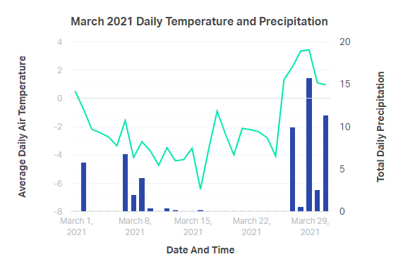
Graphics are, well, graphs. They are diagrams which show the relationship between two (or three) variables. Each graphic can contain a primary X axis, a primary Y axis, and secondary Y axis.

Click here to learn how to create graphics on your dashboard.