The basics
Connecting your data
- Uploading data to Datashift
- Proper data format for uploading
- Working with different file types
- Types of data Datashift can read
Working with projects
Working with data
- Datafile options
- Adding and deleting data
- Linking datafiles together
- Appending datafiles together
- Re-loading data
- Making data update in real-time
- Downloading individual datafiles
- Renaming datafiles
- Data headers
- Adding meta data
- Performing calculations on your data
- Working with alerts
Working with dashboards
Working with your team
Create a dashboard graphic
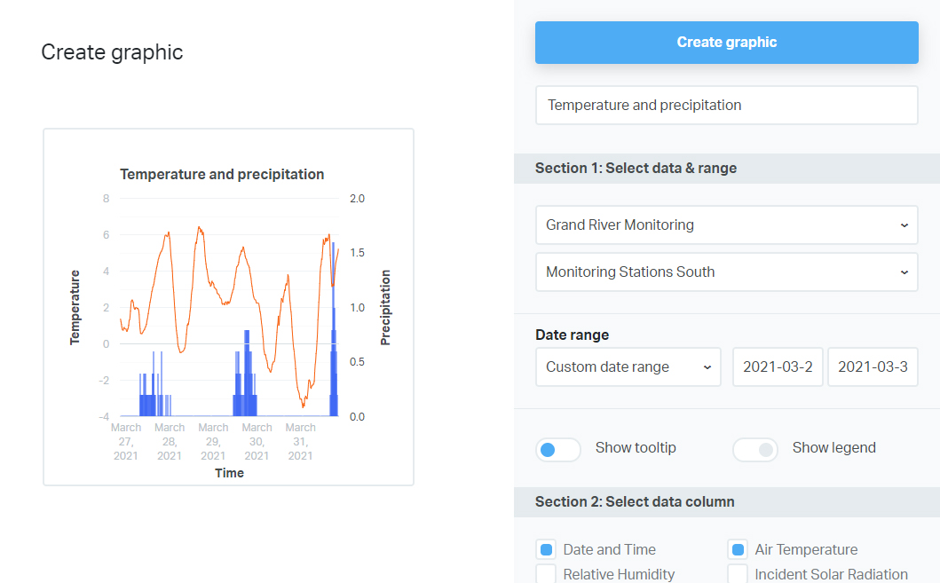
Datashift's graphic creation tool is a simple interface which allows you to easily create graphics and preview the results as you are creating. Let's take a closer look at the interface.

There are three main sections of the graphic interface, located to the left on the create graphic screen:
- Section 1— Select data & range
- Section 2— Select data column
- Section 3— Configure selected data column
Section 1: Datafile selection
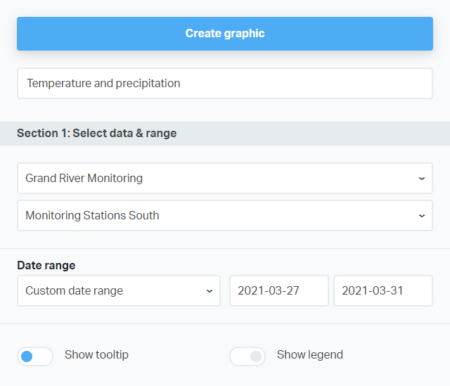
This section is where you select the data that you want to graph.
- Click the first dropdown to select the project you want to work with.
- Click the second dropdown to select the datafile you want to work with.
Tip: If you want to graph data from two (or more) different datafiles you'll have to append them together first.
- Click the Date rangedropdown to select the time range for your graph. By default, all time series data has date and/or time set to thePrimary X axis.
Tip: If you want your graphic to update in real-time select one of the pre-defined date ranges. Using a custom data range will never update your graph.
- Toggle the Show tooltipandShow legendon/off to either show/hide the tooltip and legend. They are both on by default.

Section 2: Select data column
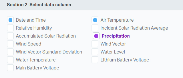
Once you select a project and datafile from Section 1, Section 2 will list all available columns for you to work with.
To add a column to your graph:
- Click the selection box of the column you want to add to your graph.
- This data column is now active in Section 3 for you to configure.
There are three states that a column can be in:
- Unselected— An unselected column is a column that does not have a blue or purple check inside its selection box.
- Selected— A selected column is a column with a blue mark inside its selection box and has been added to your graph.
- Active— An active column is a column with a purple mark itside its selection box and has bolded purple text. The active column is available for configuration in Section 3.
Important: You can only configure one column at a time. Make sure that the column you want to configure is active by clicking on it in Section 2: Select data column.

Section 3: Configure data column
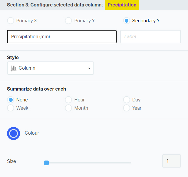
Once you have a datafile selected for configuration you have several options to customize your graph:
- Set axis— You can have up to 3 axes:Primary X,Primary Y, andSecondary Y. Once you select an axis you can customize its label (by default it is set to the column's header name.
- Style— You can set this data column to be display as either alineor abar.
- Summarize data over selected time range— For time series data you can choose to have the data summarized byhour,day,week,month, oryear. Summary is done by taking the average reading over the selected time range.
- Color— Choose the color of the data on the graph.
- Size— Choose the thickness of the data forlinestyle data columns.

As you work with your graphic, you will see the preview change with every adjustment that you make. Once you are happy with your graphic:
- Scroll to the top of the page and add a title to your new graph.
- Click on "Create graphic".
Tip: You can drag and drop graphics on your dashboard to organize them as you see fit.